This guide explores the characteristics and implementation of websites adapted to mobile platforms. It evaluates general strategic principles, some of which have been applied by large international companies, and some specific to international automotive companies. The trends described in this document are based on a study and evaluation of numerous websites in a variety of fields, and are current as to the second half of 2012.
The objective of this guide is to provide a general understanding of the discipline and of the potential benefit in developing or converting a website to maximize its utility on mobile platforms. The trends described in this document are not intended to be a substitute for specification instruction for adapting a website to a mobile platform, nor should they be used as a template for such.
The volume of traffic on the internet from mobile platforms (including smartphones, tablets and any mobile device with a significantly smaller screen than a standard PC and which can be connected to the internet) has enjoyed a meteoric rise over the past two years. According to several studies, by 2015 the number of those who use the internet on mobile platforms will be larger than those who browse online using desktop PCs. Google estimated that this threshold will be crossed by the end of 2013. Furthermore, a quarter of the total amount of internet users from mobile platforms in the U.S. accesses the internet solely from mobile platforms.
Browsing the internet from mobile platforms has become so common, that today users naturally expect to receive a level of quality and speed that is equivalent to what they receive when using standard websites on their desktop PC. Simultaneously, companies that adapt their websites to mobile platforms see a significant improvement in their website’s performance and conversion rates, as well as a clear advantage over competitors who have yet to make such a switch to mobile.
Conversely, not making the website compatible with mobile platforms is perceived as inferior and outdated service, diminishes conversion rates, increases abandonment rates, causes companies to lag behind their competitors, and to miss a large portion of traffic in favor of websites that have adapted themselves to mobile platforms.
Given the foreseen increase in the number of internet users from mobile platforms, the immense advantages that adapting websites to mobiles provide, and the users’ expectation for service that suits the platform from which they are accessing the internet, it’s obvious and clear that many organizations (such as the leading companies that were reviewed for the purpose of writing this paper) would be willing to invest many resources to adapt their websites and products to what has proven to be the future of the web.
Based on the trends that were identified during the research for this paper, we wholeheartedly recommend adapting websites to mobile platforms using the ‘Responsive Design’ approach. This is the most basic and important first step in adapting a company’s services to mobile devices. In parallel, it’s possible and even advisable to consider creating a web app or even a full application, which complements the website’s services (as discussed, compared and contrasted in more detail in the following section entitled ‘Applications’).
This summary describes the general trends in the field of mobile websites, with our recommendations:
- It is preferable to develop websites using Responsive Design. This is the preferred method for synching with search engines, and as opposed to other methods – offers optimal user experience, long-term cost savings, and much more effective content management.
- In cases where the website has been developed using a different protocol – it is mandatory to carry out a full ‘tagging’ process on all pages, in order to prevent any loss of strength on search engines and avoid penalties due to duplicated content.
- During development – it’s very important to make sure there is visual compatibility to the different mobile platforms – especially with large objects. There must also be a clear call to action.
- During development – it’s critical that the page follows a linear layout, highlighting and presenting important objects on the upper part of the screen.
- It’s recommended to use a common and effective template formula with one to three critical links at the top of the page, followed by a visual object, followed by a menu.
- With Responsive Design – the content is identical to the source pages. However, e-commerce companies usually choose to create a dedicated site, with a very high focus on motivating users to take action.
- It's recommended to develop web apps and actively suggest them to users, as well as promote these apps using large, visible call to action buttons in both the mobile and desktop versions.
We’ve specialized in this technology, and have developed many successful strategies for maximizing effectiveness in both mobile and desktop web structures. We would be happy to be of service to you, and to implement these recommendations. Furthermore, we are ready to assist in preparing a detailed plan for adapting your website to the future generation of online browsing.
General
Using the internet from mobile platforms is significantly different than using the internet on computers with a large screen and solid internet connection. It requires not only managing a decrease in bandwidth volume between the website and the user to enjoy improved loading time, but it also necessitates adapting the content and interface to small and non-traditional shaped display interfaces. Emphasizing links that call for action become more important strategically, taking into consideration the minimal time users spends on the site and the limited screen size which restricts content on view at any given time. The concept of mobile platforms doesn’t regard only mobile phones, but also tablets and other gadgets that allow internet usage, using small to medium variously sized screens. One must also consider weaker computing systems as well as a fainter and varying internet connection through movement of the device among cell towers and Wi-Fi hot spots, although these issues are diminishing due to new technological advancements. For the purpose of collecting data and analyzing trends identified in this paper, we carried out a widespread review of the results of large international companies from a variety of industries. Among those that were reviewed and for which we use for examples include;
- Automotive – Mercedes (the American site), Smart, Volkswagen (the international site), Hyundai (the American site)
- Car rental – Thrify.com, Hertz.com
- Aviation – Air France, US Airways, KLM
- Tourism – Booking.com, Tripadvisor.com
- Communications – CBS, CNN, ESPN
- Beverages – Coca Cola (the international site) Grey Goose, Grolsch
- Technology – Fork, WordPress.com, Dropbox, Facebook, CMS.com
To illustrate our points in this paper, we will utilize screenshots from these various sites. However, in order to fully experience the significance of the design, the interaction and the planning involved both in accessing and operating a successful mobile application, we recommend that you log onto the website ‘live’. We have provided a text URL and a live link to the appropriate website. We highly recommend visiting these websites in order to experience and fully understand the subject matter.
-
The necessity of adapting to mobile– traffic volumes from mobile platforms
The first question when considering adapting a PC-based website to mobile is; “is it necessary”? In other words,” is there a large enough user-base to justify carrying out an adaptation”?
According to data as recent as June 2012, there were 1.2 billion mobile platform users. In addition, an average of 15-25% of visits to websites was made from mobile devices. Furthermore, it is estimated that a large percentage of these users conduct their online activity solely from their mobile platforms (in June 2012, the U.S. figure was 25%). Finally, the prediction of experts is that the volume of mobile traffic will increase immensely in the near future. In 2010, Morgan Stanley estimated that by 2015 the number of website visits from mobile platforms will exceed the number of those from desktop PCS. In 2011, Microsoft estimated that this will happen even earlier – by the end of 2014. Google estimated that this will happen by the end of 2013.
Morgan Stanley’s estimation regarding increasing number of users on different platforms:

For more information on this subject, click here, and click here for an additional website.
According to various current industry publications, by February 2012 over half of the population uses a smartphone. In Israel alone, there are 3.1 million smartphone users. Furthermore, it is predicted that in the next few years the entire mobile market will transition to smartphones exclusively.
To summarize – it’s clear that not only will internet usage from mobile devices become a key factor in the near future, but may become the primary gateway for accessing the internet.
-
The necessity of adapting to mobile – the benefits
After clarifying that there is in fact a robust user base that the adaption is relevant to, the next questions are; “is there a demand for it?”, and, “what are the benefits that the company will gain by adapting its content to mobile platforms?”
The answer to the first question is a resounding “yes”. With the rapid increase in the usage of mobile platforms for internet activity, users naturally expect that the site they access will function properly. This topic was detailed at the end of 2011 in an article featured in Forbes Magazine, entitled “a bad mobile experience will no longer be tolerated”.
As for the second question, there are a number of aspects in which there is benefit to both the user and the company from adapting a website to mobile platforms:
The image aspect
When a user visits a company’s website from a mobile platform and comes across an unusable website, one that is displayed badly or offers a substandard user interface (as it happens with most traditional websites when displayed on mobile devices), this experience is clearly damaging to how the brand and the company is perceived, and therefore creates a breakdown in the credibility of the product and the brand as perceived by the visitor.
This is especially true in cases where the brand represented on the website has a higher ‘price tag’ and/or is intended for long-term usage, like, for example; a contracting company that’s unable to maintain a functional website, and furthermore presents mobile users with a unusable website – this works against the confidence a user will have in the products and the brand itself. This is more dramatic than if it was a company selling small items such as candy.
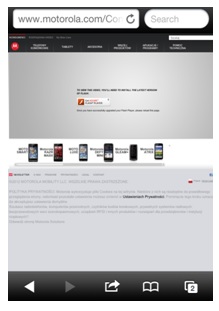
Compare the excellent mobile adaptation done by Mercedes on m.mbusa.com or Grey Goose’s website – greygoose.com. In these websites, users are either impressed by the brand or accepting of the experience, since the design, navigation and reliability creates no stress and no difficulties. In contrast, mobile users, including iPhone users, experience complications and may not be able to easily find what they need when visiting a website like Motorola Mobility. Ironically, this is a company that manufactures mobile devices yet their website is unreadable; it’s configured to squeeze the website into an impractical display size and contains technologies that are unavailable to some mobile devices.
Screenshot – Motorola Mobility (via iPhone)
Notice the missing content due to application of a technology that isn’t available on the iPhone (Adobe Flash elements), as well as the tiny font size. If you access the live site from a mobile device, you will also discover non-functional action buttons.
The service/conversion aspect
The ability to provide a better mobile user experience, both from the aesthetic aspect as well as the user interface aspect, is directly translated to better service to the client (which also positively affects the brand perception issue), and allows for an increase in the number of conversions due to the simplicity of use. This is directly contradictory to a website that hasn’t been adapted, in which users who would be interested in leaving their details or making a purchase, would run into significant difficulties and simply pass on to a competitor.
The competitive aspect
There are still many commercial and informational sites across the web which haven’t been adapted to mobile. Considering the boom in internet usage data from mobile platforms over the last few years (see next section), it’s clear that adapting a website to mobile represents a huge competitive advantage over companies who haven’t made the change, due to the ability to respond and service the great percentage of users that originate from mobile devices. Thus, adapting a website to mobile platforms enables companies not only to offer better service, but also to increase their customer base at the expense of their competitors, as users will be unable to use those competitors’ websites on their mobile devices.
Compatibility and search engines
Most search engines, especially Google, have the ability to index and present search results in a way that distinguishes between mobile users and ‘standard’ users. As a result, when a user uses a mobile platform to conduct a search, there are a number of preferences that are harvested and which identify the device so that Google, for example, will prioritize sites that are adapted to mobile. This benefit provides another advantage over competitors who haven’t made their sites compatible.
General usage
There are common technologies in standard websites that aren’t functional at all in some mobile devices (for example – certain Flash-based features that aren’t available on iPhones). Presenting a broken page or pages with missing text damages the user experience, which is another reason why it’s recommended to move forward with the adaption.
The effect of loading time on usage
Polls show that between 70 to 90% of users abandon pages that require more than 5 seconds to load. Mobile platforms, especially those that make use of cellular communication, require ‘lighter’ websites. Otherwise, their loading time will be fairly long due to varying access to bandwidth as well as the processing capabilities of mobile devices. Adapting websites to mobile platforms requires significantly lighter websites, resulting in streamlining and prioritizing of content presented.
To summarize – it’s clear that mobile clients expect a user experience that is no less than what desktop PC operators receive. Correspondingly, companies will enjoy many benefits simply by offering proper browsing from mobile platforms to users who demand it.
-
Adapting websites to mobile platforms – current status and case studies
We have established that there is a solid user base justifying the adaption of websites for mobile access, and since companies see the potential benefit in doing this, many companies do in fact invest in this practice and adapt their websites at different levels.
In fact, all the companies – without exception – that were reviewed below were found to have full compatibility to mobile platforms. From our experience in this area, we have discovered that in large company websites there is bound to be significantly higher rates of compatibility than that found in smaller sites. This doesn’t mean that the situation is all encompassing, nor is it a required web standard today, but it is coming. Contrasting that convention, we can point to many fairly large companies which are not compatible with mobile platforms (for example Nutella –nutella.com, or the large Israeli aviation company EL AL – elal.co.il).
However, it seems that large companies, who have a great deal riding on their websites, and who see plenty of activity there, usually see to it that their websites are adapted to mobile platforms. This is primarily due to their understanding and experience of additional profits that come from reaching larger markets, as detailed above.
According to a number of case studies, companies which have identified that a large portion of their users are mobile users and have committed to adapting their website – have achieved a significant increase in traffic to their site, number of pages viewed and the amount of time users spend on the pages, all while realizing a decrease in abandonment rates (by decreasing the amount of mobile users who may have previously viewed a dysfunctional website and immediately left). The biggest benefit though is an increase in conversions and revenue.
Case Studies
The volume of traffic originating from mobile devices reached 40% of the overall volume of visits to this website. Within 2 weeks after completing the adaptation, the following figures emerged:
- 64% increase from ‘mobile’ visits
- 10% increase in unique visitors
- 82% increase in the number of page views from mobile devices
- 50% increase in revenue coming from mobile users
(Data:Google’s GoMo service)
This company ascertained that 25% of the searches for tickets in the U.S. were made from mobile devices. They decided to adapt the website, but not the application, in order to be compatible with all platforms, and to allow for constant updates and alterations, and also to save money on commissions that they would have to pay for actions taken on the application. Within one month of completing the adaptation, these were the figures:
- 8% increase in average sale value from mobile users
- 50% conversion rate increase from mobile devices
- The number of transactions increased by 100%
- The revenue from ads on the site increased by 30%
(Data: Google’s GoMo service)
-
The technical configuration of mobile-compatible websites
From a technical standpoint, there are 2 main constructions in order to adapt a website to mobile platforms; 1) based on a standalone URL and HTML, or 2) based on separate configurations (at either the HTML level or URL level).
Up until recently, it was common to adapt websites to mobile based on separate architecture. However, in this case, 2 websites (or more) were built – one for desktop PCs, and the second (or the rest of them) for a mobile in a specific size or a number of sizes. As mentioned before, the separation can be at the code level (in other words – the same URL for all the website’s versions, yet the server identifies the platform and directs each platform to the appropriate website), or at the URL level – different web addresses, whereby the code is implemented only for one version (for instance – example.com for desktop, and m.example.com for mobile).
This URL level configuration has a number of disadvantages:
- The need to design, code and debug two or more versions usually prolongs the project development time.
- Accurate tagging is required in order to ‘educate’ search engines that two versions of the same content have been adapted to different platforms, and that this isn’t a case of either hidden content (when serving a different code) or competitor websites (when showing a different URL).
- In the case of separate URLs – external links are divided between both websites, which splits the user count, hurts the website’s strength and lowers its ranking in search engines.
- It also limits quality display only to platforms that have the specific display size for which it was designed, and excludes or lessens the experience on non-compatible devices.
The following are a few examples of websites that were developed with separation at the URL level:

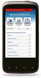
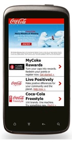
In the automotive industry, all the websites that we reviewed (Mercedes, Smart, Volkswagen and Hyundai) make use of the separation configuration according to URL. In other words – there are separate websites for desktop PC users and mobile device users.
Developments at the code level, as well as an official statement by Google that they prefer the one URL, one code configuration (although they do accept others as well – for more information click here), have made this configuration the most conventional and recommended today. This configuration is called Responsive Design, since the website itself recognizes what the viewing platform is (and in most cases – specifically identifies the screen size on the viewing platform), and responds to it. Code within the website adapts the website’s design, in real time, to the mobile device. In Responsive Design, regardless of what the platform is accessing it, there’s always use of just one URL and the same code, which contains relative and undefined design guidance (in CSS). The design guidance is ‘liquidated’ – in other words different objects, such as text or image, aren’t defined to a specific size – for example – 100 pixels, but rather are defined relatively, for example to be presented at 50% of the mobile platform’s screen size. This configuration has numerous advantages:
- It shortens the technical development time (there is no need for multiple websites)
- It shortens the content development time (there is only one set of content)
- It simplifies the operation of the system in the future (there is no need to maintain and update content on a number of sites)
- It accepts any platform that accesses it, as well as new display sizes that will most definitely be introduced in the future, since the adaptation is done in real time, according to the platform’s dimensions and capability.
- It strengthens the website in the search engines – all links lead to one URL, all users go through one URL, and there are no indexing issues.
The following is a number of website examples that were developed using full Responsive Design. It’s impossible to illustrate this design adequately in a screenshot – we recommend you visit these websites, perhaps from a desktop and a mobile device, play around with the browser itself, and observe the changes in the website’s structure and display.
Summary
The recommended method in adapting websites to mobile today is Responsive Design. If for any reason this method isn’t preferred, the method of separated URLs can also be used, although the disadvantages to this choice have been illuminated above. Separation based on different HTML is also an option, but this should be avoided if possible, since this method holds the biggest risk of all for errors, both in response to the newest mobile platforms, and in reaction by search engines.
-
Content strategy
When adapting websites to mobile platforms, the question of content strategy comes up; should we show mobile users the same content that desktop users see (either in full or partially) or develop a separate website for each entity? Furthermore, there is clear importance to the content design, due to the screen size of mobile platforms. Some mobile sites will hide or ghost some lesser used features that appear on the PC formatted versions.
5.1 Content structure
Due to the minimal size of mobile platforms’ screens, size of objects within a website is a critical consideration. All the objects that make up the page must be relatively big – starting with the text, including the menus, and encompassing the images. This topic has significant importance on the ability to efficiently call users to action – the call-to-action buttons must be prominent, and the detail submission fields must be exaggerated and expandable when entering data.
An example of the size of objects:
CBS – notice the size of every object on the screen, the cleanliness of the layout and the scarcity of unnecessary objects.


5.2 Amount of text
As a result of enlarging the elements, and in order to maintain the pages’ readability – it’s necessary to significantly decrease the number of objects displayed on screen. In addition, it’s important to place the website’s most important elements on the initial screen that’s first displayed (The ‘Home Page’). This trend can be clearly seen in the screenshots above.
5.3 Content layout
Due to the screen size, the content layout in ‘mobile’ pages is generally configured opposite from standard rectangular horizontal big screen websites – the layout on mobile devices is defaulted to vertical, actually a narrow portrait configuration. In some devices, however, you can change the orientation of the device and the content will follow suit, reconfiguring itself to a narrow horizontal field. But instead of opening multiple windows or different pages, content is scrolled. In fact, in many mobile websites, the page is like one long movie to scroll with a finger swipe or a controller. However, it’s important to understand that users don’t tend to scroll down too much, and furthermore, very long pages tend to extend loading time so it’s important to avoid creating ‘movies’ that are too long.
As a common and effective strategy, many companies place the most important 1 to 3 links at the top of the page, followed by a large visual object, and then farther down – the site’s menu. It’s highly recommended to maintain this structure on every mobile site that is built. At times a horizontal ‘movie’ can be added either above or beneath the visual object, or the object itself can be turned into a slider. This movie is a horizontal string of objects that can be scrolled through and possibly zoomed in on by a different finger interaction with the screen. In any case – a very noticeable current trend is to limit planning a website that requires multiple directional scrolling – the combination of scrolling horizontally and vertically usually results in orientation issues on the page for users.
The following are a number of examples of vertical content layouts. Notice the location of one important object at the upper part of the page (a link to find a nearby dealership), followed by a visual object (an image or slider), and followed by the site’s menu. Also notice that, in accordance to the issues we have recommended earlier – there are very few large objects on the page.


5.4 Content composition – dedicated or duplicated?
When a website is adapted to mobile using Responsive Design (meaning uniform text no matter how it‘s accessed, and as reinforced here – the most common and conventional way to adapt), there’s no need to make any content changes, since we’re dealing with just one website. Those who use mobile devices will be shown the same content as their ‘desktop’ counterparts, just in a manner that’s visually adapted to the platform on which they’re accessing the experience.
This is the optimal way to handle content, from all aspects:
- It saves time and work creating content.
- It allows maximum compatibility with mobile devices, and maintains strength on the search engines.
- It’s the ideal mobile user experience – the user isn’t ‘punished’ and doesn’t miss out on content just because he uses a mobile platform (this structure presents the user with the richest, fullest content).
- It provides maximum profit for the company – the user is exposed to all content, and all products – there is no need to offer anything less just because browsing is done from a mobile platform.
Separated configuration – a trend dependent on the website’s characteristics
When it comes to separating between a ‘desktop’ website and a mobile website, the trend today is mixed, and seems to be dependent on the website’s objective.
Content websites
Websites such as media and communication networks, newspapers, portals and so on – the mobile website for this category of content is usually a duplication of all (or most) of the content from the desktop website. The result is fairly long pages, at times even crowded, yet rich in content to be consumed. In many cases the main page contains only highlights, a category toolbar, and a launch point to open supplementary content that may be ‘hiding out’ on linked pages.
Example: CNN

E-commerce websites
In websites that have an objective of motivating users to take action, whether for the purpose of selling, collecting leads, downloading support files and so on – for the most part there is a tendency to develop a standalone independent website for mobiles, based on a specific presentation (different than what is shown in the desktop version) of products, or at least displaying and highlighting only a limited subsection of the most popular products. This trend allows creating pages with fewer objects, yet pages that are clearer, more focused on their call to action.
Example: KLM – notice the focus on the call to action

Mercedes USA – notice again the focus is on a clear call to action using the three links with attractive icons at the top of the page – selecting a vehicle, finding a dealer or viewing the special offers.

Booking.com – again, a clear call to action
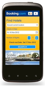
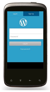
Another trend that has been identified primarily on large websites that offer a specific service to users, is creating a login page as the home page on mobile versions, even if on the desktop version there is no need to login in order to use the website.
An example of this type of approach can be seen on WordPress.com:
Summary
As far as current market trends, the decision to develop either a dedicated website or a website mirroring the content of the desktop website, depends on the technical structure of the website and its objective. Whether a dedicated site or mirror site has been developed, the website’s objective and characteristics are carefully maintained in the transition from the desktop website to a mobile one.
E-commerce websites, whose objectives are either sales or lead collection, and who have adapted a separate website for mobiles – have typically developed dedicated websites, with a homepage that boasts a very clean appearance, with minimal objects and a very visible call to action. In most of the sites that were not built using Responsive Design, there was a certain content reduction made.
The following trends have been seen as very beneficial in a large number of websites, and it’s recommended to incorporate these in every mobile website being developed;
- Visual emphasis – large objects, clarity in the call to action.
- Visual ‘cleanliness’ – a minimal number of objects on a page.
- Vertical layout – placing the most important objects on the upper part of the page.
- A conventional and effective structure – 1 to 3 critical links at the top of the page, followed by a visual object and grounded by a menu.
- Responsive Design – identical content to the source pages. In e-commerce companies’ mobile websites – usually a dedicated website, with a very strong focus on the call to action.
6. Unique features that characterize mobile websites
Aside from the key features as described above in regard to content (such as large objects, minimum number of objects on the page and a crisp menu), there are secondary features that exist on most mobile websites.
6.1 Automatic redirections according to platform
In cases in which two (or more) separate sites were built, using different URLs, many websites choose to implement a strategy of mutual redirections to ensure that every platform is directed to the website that was developed specifically for its screen size. In this way, desktop users that reach a mobile website are immediately transferred (without them noticing and before the site loads) to the desktop version, and vice versa. This is one of the disadvantages of this method. When using Responsive Design there is no need to activate complex processes that determine which user reaches what site, and there is no need to update the redirection list every time a new mobile model appears on the market.
6.2 Link to a parallel website in the footer
Since these redirections are done automatically, without user control, in most websites that utilize automatic redirection there will be a link to the other version – this link is used to cancel redirects. A click on this link will take users to the opposite version (for instance – from the mobile version to the desktop version), and ‘locks’ their device so that users will be able to stay put, even if the automatic redirection was supposed to transfer them back to the mobile version. It’s customary to place this link at the bottom of the page.
Example: KLM – the link to the standard desktop version is in the red circle.

6.3 ‘Folding’ toolbars and zones
In order to keep the page as clean and uncluttered as possible (in accordance with section 5.2), many mobile websites make much use of ‘folding’ navigation toolbars and content zones, meaning that one click on the relevant tab opens the navigation toolbar or a whole content zone, and another click folds it under the tab and hides the content.
Example: espn.go.com – with the VIDEO zone open

The same site (ESPN) with closed video zone:

6.4 Side toolbars
An additional method that is very common in mobile websites is to create toolbars that open or close on the side of the screen, with the homepage able to slide to reveal the menus by a finger swipe.
Example: mobile.mako.co.il – open toolbar:

Mako website – closed toolbar:

Message via the mobile device’s NATIVE messaging system
There are many websites that use the mobile devices built in messaging system in order to communicate messages related to their product, however, this type of practice usually concerns users, as the messages appear to be innocent system messages which can fool users into clicking ‘OK’ without much thought. This is perceived as ‘crossing the line’ between the user, device and website and promotes a loss of trust with the brand. It’s recommended to not make use of this scheme in order to display a website’s dialogue boxes.
6.5 Payment via PayPal
Many mobile websites offer payment options that include PayPal, and this is done in order to alleviate any concerns the user may have about secure transactions. Shopping carts and payment protocols on mobile devices are often perceived as ‘less secure’ in the eye of the general public.
-
Dedicated applications – giving precedence to the application/ adapted website
Applications are a dedicated small program designed to transfer information and increase the chances of conversions with mobile users. To the common and familiar tool known as an ‘app’ (a light application that can be downloaded from iTunes, Android stores and specialty websites), another version was added – the web app. Web apps are browser pages that were uniquely designed, and which emulates actions done on an application. These may be launched from an icon on the browser’s desktop. It resembles the launch button on a mobile device but in actuality, it’s a simple shortcut to a webpage on the browser. Web apps don’t require updates like regular applications, nor do they need to be downloaded or purchased from a store or a dedicated site, but do require a functional internet connection to operate.
In general, the ‘standard’ apps are beneficial for both the user and the company, but they don’t directly benefit the website, since the visits and actions taken by users within the application aren’t considered visits to the website, and actions aren’t counted as if they were taken within the website. Thus – the company gains an active customer, but the site loses one – a point that is important to consider in performance analysis. The web apps are different in that way, since they operate through the browser, and thus they are usually considered as a regular visit to the website (unless they were coded in way that intentionally bypasses the website).
In regard to ‘simple’ conversions – quick transactions, orders or leads – it’s important to give precedence to having these actions completed in the mobile compatible website – the absolute number of actions taken within these websites is usually higher, and being a mobile site allows for simpler and quicker updates and changes than it would have been if it were an application. Furthermore, a well-built mobile website using Responsive Design will be fitting for all platforms, while an application is usually limited to only one platform.
However, in regard to ongoing transactions (such as VOD services), or recurring orders of consumables (such as water purifier filters etc.), or building customer loyalty to a brand over time (for example – ongoing contact and support with the owner of a new vehicle) – it seems as if users prefer applications, as they have a clear advantage over websites.
The dominant trend on the market today is offering applications to users, which are parallel and linked to a website. Most of the large websites we reviewed offer applications. As far as content, the application offers the user richer content than what is found in most mobile websites – at least in the e-commerce websites. In the content websites, there are usually additional options on offer, such as saving content for offline reading/viewing, viewing VOD content and so on. For the most part, applications will also offer upgrade options or the choice to directly purchase from the application itself.
Today, it seems that the dominating trend is to actively promote a free download of the application from within a website – upon first entering the site or when opening a new session. There is a prominent message upon the first visit that offers or motivates users to download the application. The user can decline, and move on to view the website’s content, and downloading the application won’t be offered again (until the next session). Still, action buttons that link to the application will still be visible on the page even after the user’s initial decline (or if active promotion wasn’t carried out).
Recently, there is much criticism from users on this type of seemingly forceful promotion. However, it seems that this method significantly increases the number of downloads, which is why it’s still a conventional method. It should be pointed out that there are many company websites that have applications, but this application may not be offered at all within the mobile website, or is offered only on the desktop version – this is a grave yet common mistake, and it should be avoided. The application should always be on offer within the mobile website, and if possible – also on the desktop version.
Examples of applications that are offered upon first visit:
This is an active offer to install a web app upon a user’s first visit to espn.com (bottom of the page, the message bubble)

Examples of other links and action buttons that offer applications upon first visit:
Dropbox.com – the large green action button is the offer.

Tripadvisor.com – text link at the very top of the page.

Summary
The dominant trend today is developing either applications or web apps in parallel with a mobile compatible website, and actively offering these to users upon their first visit with the help of prominent actions buttons throughout. We recommend developing applications as tools to retain customers and increase the chances of conversions in the future, even at the early expense of visits to the website. We also recommend promoting the applications both on the mobile and desktop website versions, with the mobile website taking priority.


